Post Purchase
Revamp.
Re-architecting Flipkart's Order Details Page so customers could solve their own problems, calmer, faster, without calling Agent-Serve. A self-serve framework, not another widget.
76 Bps
↓ Issues Per Unit (IPU)
74 Bps
↓ Return To Origin (RTO)
112 Bps
↑ Self-Serve Engagement
3-digit Bps
↑ Self-Serve NPS

The premise
India’s most-visited Order Details Page was bleeding customers to a call centre, not because it lacked features, but because it lacked a spine.
01, About the Project
Re-architecting the page everyone lands on.
The Order Details Page (ODP) is where every Flipkart customer lands after they buy something. It's the highest-intent page in post-purchase, and it was leaking customers to Agent-Serve every time something went sideways.
The brief looked simple: improve self-serve effectiveness on ODP. The actual scope was much bigger, make the page future-proof, so every new fulfilment use-case could plug in without breaking the experience or starting another re-design from scratch.
Duration
2 months (design phase)
Status
Partially shipped, ongoing
Team
1 Designer · 2 PMs · 1 Eng Head
My role
Sole designer
02, Who shows up here
Three users, three states of mind.
Post-purchase isn't one audience. It's the same person showing up in three very different emotional states, and the page had to meet each one without forcing them into the wrong loop.
👀
The Watcher
Repeat short visits, just checking
40–45% of post-purchase visits are quick, repeat sessions. They open the page to confirm delivery is on track, the refund landed, or the next step is queued. Anxiety, not action.
📞
The Caller
Stress hits, they pick up the phone
12–15% of contacts are stress sessions, pickup not done, slot mismatch, alternate delivery. Self-serve was losing them to Agent-Serve before they even tried it.
🚪
The Escapee
Cancellation as a coping mechanism
Any deviation from the Customer Promise Date felt broken. Users cancelled to feel back in control, even when they didn't really want to.
03, Challenges
Three constraints that defined the design.
Constraints make designers honest. These three forced us out of “ship another widget” mode and into systems thinking.
01
Limited engineering bandwidth
Mid-pandemic priorities meant every design decision had to be cheap to ship and easy to scale.
02
One-fold scrolling, low discoverability
Users almost never scrolled past the first fold. Critical fulfilment actions were buried where no one looked.
03
Stagnation to scalability
Every new use-case meant another bespoke widget. The page couldn't grow without breaking.
04, Competition
Where the category was, and where it wasn't.
We benchmarked Flipkart against the post-purchase experiences of every serious player in the market, retail, food, ride-share. Most were doing the same thing: a chronological status feed, no contextual action, no recovery path.
Introduction · User perception
Putting the challenge into perspective.
Where the category sat, and where Flipkart was sitting alone.
Allows change in order details before delivery
Doesn’t show
“Help” upfront
Shows
“Help” upfront
Doesn’t allow change in order details
😭And yet… Self-serve NPS was poor because nobody knew the page could help them.
05, Diagnosis
The page was talking. No one was listening.
Heatmaps and session replays told us the same thing: the average user scrolled one fold. Anything past it might as well not exist. Meanwhile fulfilment actions, exactly what users came for, were stacked low and styled identically to non-essential content.
Worse, the page had no underlying structure. Each new use-case (cancel, return, reschedule, address change, slot pick) was a bolted-on widget. The page was a parking lot, not an interface.

06, Page anatomy
Every section, earning its place.
The new ODP made three principles tangible. A Dynamic Widget whose content and CTAs are driven by the order's actual state. Bundled actions that group related self-serve flows so users never have to hunt. Page hierarchy rebuilt around the one-fold reality — fulfilment first, everything else after.
Walk through it fold by fold below. Each node has a job, a hierarchy, and a clean handoff to the next.

01Hero card, fulfilment first, one tap to the most likely next action.

02Dynamic widget, content and CTAs change with order state.

03Bundled actions, related self-serve flows grouped, never hunted.

04Demotion zone, recommendations, support, anything non-fulfilment.
← Swipe, click dots, or use arrow keys
The insight that pivoted the project
“The page wasn’t a page. It was a parking lot for every fulfilment widget the company had ever built.”
— From the diagnosis review, week 3
07, How the timeline thinks
From a status feed
to a stateful guide.
The timeline was the most-looked-at, least-trusted piece of the page. We rebuilt how it thinks, what each node should mean, what it should say, and what action it should carry.

01What a timeline is supposed to do for the user, communicate state, signal what's next.

02Old: vague stages, no temporal anchor, no actionability.

03Old: status copy that meant nothing to a customer trying to plan their day.

04Old: identical visual weight on every node, nothing to anchor the eye.

05New: stateful nodes, current step amplified, past steps quieted.

06New: contextual copy tied to the actual order, not the catalog.

07New: every node carries the right action at the right moment.
← Swipe, click dots, or use arrow keys
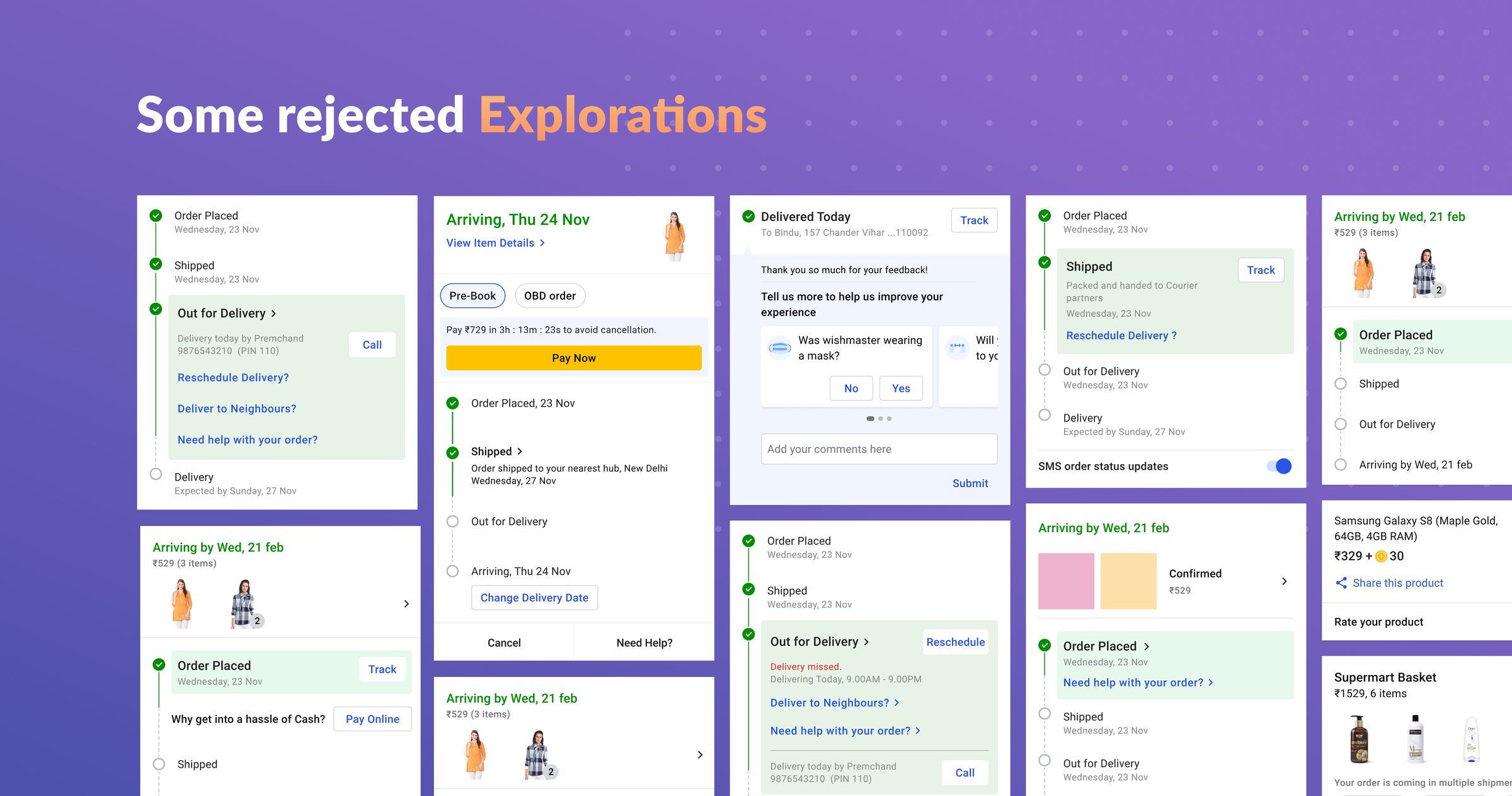
08, What we rejected
The roads not taken.
One strong direction almost made it. It solved part of the problem, but didn’t scale. Sharing it because the discard explains the keep.
09, Framework
From a parking lot
to a framework.
Three principles drove the new system. Each one solved a specific failure mode of the old page, and each one had to be enforceable across every PM team that shipped into ODP.
🪜
Hierarchy by intent
Surface what the user came for in the first fold. Demote everything else.
🧩
Composable framework
Replace one-off widgets with a system PMs and engineers could extend without redesign.
🔁
Habit, not heroics
Make self-serve the consistent first answer, so users stop reflexively calling.
10, Feedback framework
Same voice, across every state.
Confirmation, in-progress, soft warning, hard error. Four moments of feedback, one consistent system, so users learn to trust the page.

01Confirmation, success states with clear next steps.

02In-progress, system is doing something, here's where you are.

03Soft warning, deviation from plan with a path back to control.

04Hard error, what broke, what we did about it, what you can do now.
← Swipe, click dots, or use arrow keys
Live in production
Shipped, in a million pockets.
Captured in the wild, on the production app. The dynamic widget responding to actual order state, bundled actions inviting the one-tap path back to control.

11, Impact
Measured against the control set.
Bps = basis points (1 Bps = 0.01 percentage point). At Flipkart's scale, a 76 Bps shift in IPU is millions of avoided contacts.
Reductions (lower is better)
- Issues per Order Unit (IPU)↓ 76 Bps
- Return To Origin (RTO)↓ 74 Bps
Increments (higher is better)
- Self-Serve Engagement (SSE)↑ 112 Bps
- Self-Serve NPS↑ triple-digit Bps
12, Key Learnings
What I'd carry forward.
Consistency is the real lever for habit
The revamp was as much about behavior change as visual design. Widgets had to look and behave the same across every use-case so muscle memory could form.
Frameworks are deeper than they look
Designing one widget is easy. Designing a widget that absorbs every future use-case without re-architecting is the actual job. It needed weeks of pattern-finding with PM and engineering.
Watch what users do, not what they say
Quick scan, contextual action, that was the real loop. Once we saw it, the redesign almost wrote itself.
Credits
Design · Anubhuti Jain Singh (sole designer)
Product · 2 PMs, Self-Serve & Reverse Flows
Engineering · 1 Engineering Head + team
Year · 2021 to 2022